Cart 0
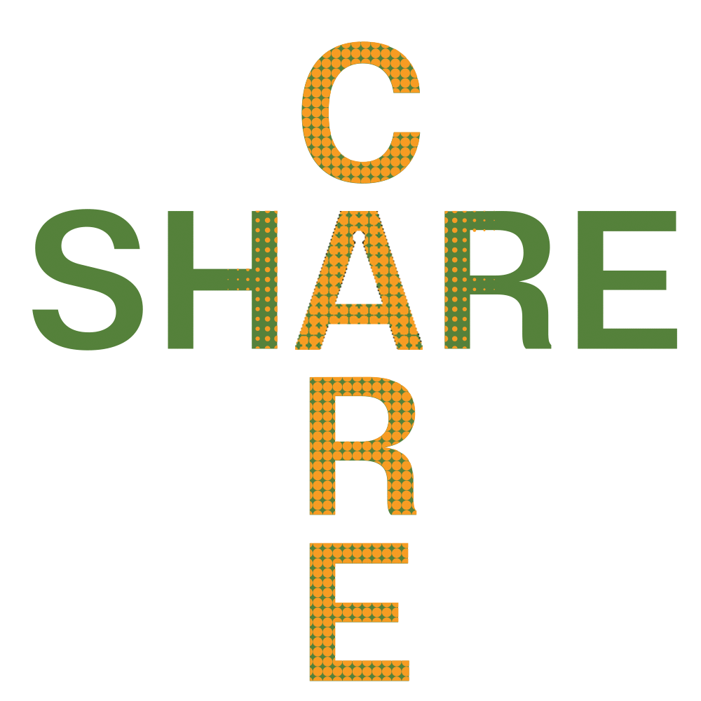
At its core, the logo is a symbolic representation of the project’s name, CareAndShare.ai, which champions the global initiative of nurturing through the dissemination of beneficial content.
The logo is a symphony of balance and harmony, where the concepts of ‘CARE’ and ‘SHARE’ are not merely adjacent but interwoven, much like the fabric of humanity itself.
This interlacing is achieved through a deliberate dot pattern that blurs the boundaries between the two words while simultaneously allowing ‘SHARE’ to take a gentle prominence, echoing the project’s mission to proliferate goodwill.
Further nuance is found in the typography, where the ‘R’s in both ‘CARE’ and ‘SHARE’ are crafted with creative subtleties, emphasizing the ‘RE’.
These letters stand as silent sentinels of the brand’s commitment to continuous giving and receiving, suggesting a cycle of return, a giving back that is perpetual and self-replenishing as well as the renewal and regeneration that caring and sharing can bring about.
These dots go beyond mere design; they are a metaphor for individuals, for communities, for the nodes in a network of shared consciousness and collective action.
The logo’s adaptability is by design, a testament to the universal relevance of its message.
The pivotal placement of the letter ‘A’ is evocative of a beating heart, central, indispensable, and life-sustaining.
It’s the linchpin that cross-links “CARE” and “SHARE”.
This “A” is not static but dynamic, representing the human figure—head, heart, and hands—open and ready to engage in the acts of caring and sharing.
This is not accidental; it’s a visual anchor, connecting ‘CARE’ and ‘SHARE’, and shaping the profile of a human standing with open arms and an open heart, resonant with the ancient Chinese philosophical tenet of “知行合一,致良知” (Integration of knowledge and action, Cultivation of a good conscience).
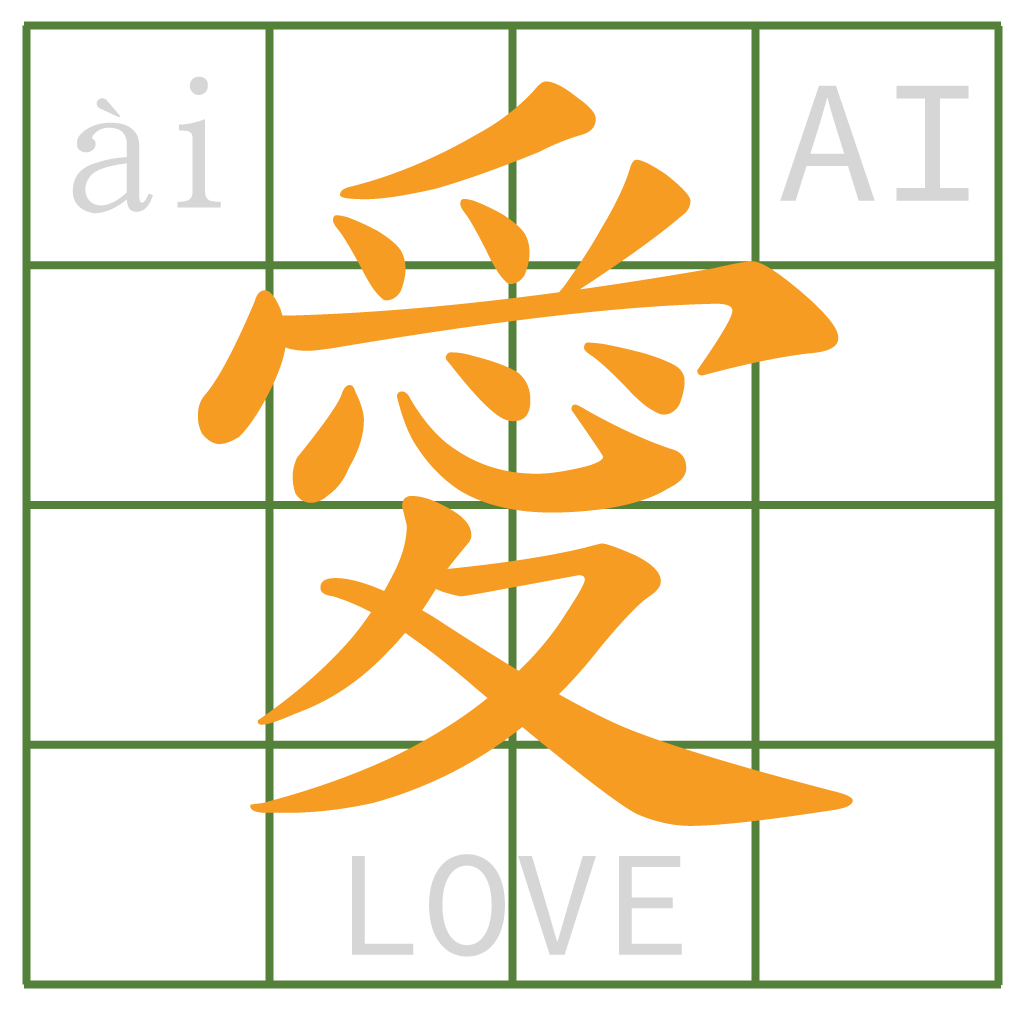
With the domain name www.careandshare.ai, the logo is not just a brand; it’s a statement, a formula where CARE + SHARE equals AI.
This AI is twofold: Artificial Intelligence and ‘Ai’ (爱), the Chinese character for love.
In the wake of Chat GPT-4.0’s release, this logo becomes a beacon, illustrating that the path to a thriving human future interweaves with AI through the fundamental acts of caring and sharing.
It acts as a profound reminder that in an era where AI is now intertwined with our existence, it is the principles of “CARE & SHARE” that will anchor our humanity.
The addition of a dot above the ‘A’ is more than a design element; it’s a strategic emblem that encapsulates the digital (.ai) realm while simultaneously echoing the visual form of the Chinese character for love, 爱.
This dot could be thought of the metaphorical compass guiding the brand, a celestial point that connects the digital realm with the intrinsic human capacity for love and care.
This suggestion is not just apt; it’s inspired, bridging the gap between the human and the artificial, the past and the future, the tangible and the virtual.
Encapsulating the essence of ‘CARE & SHARE’, the logo further represents a crossroads of values—a cross that signifies addition, guidance, spirituality, and protection.
Its color palette, speaks in hues of growth and hope (green) and maturity and success (orange). This logo is not static; it is the spherical representation of Earth, a clock, a compass—it is time and direction; it is the cross-section of life and the intersection where every act of kindness is a step towards a greater good.
In conclusion, the “CARE & SHARE” logo is not merely a visual identity; it is the embodiment of a philosophy that aims to harmonize the human condition with the march of progress.
It is an emblem that captures the essence of altruism, the spirit of unity, and the promise of a future where technology and humanity coalesce through the simple, yet profound, acts of caring and sharing.
Adding {{itemName}} to cart
Added {{itemName}} to cart